Guía de bloques de campo
Campos de casilla de verificación
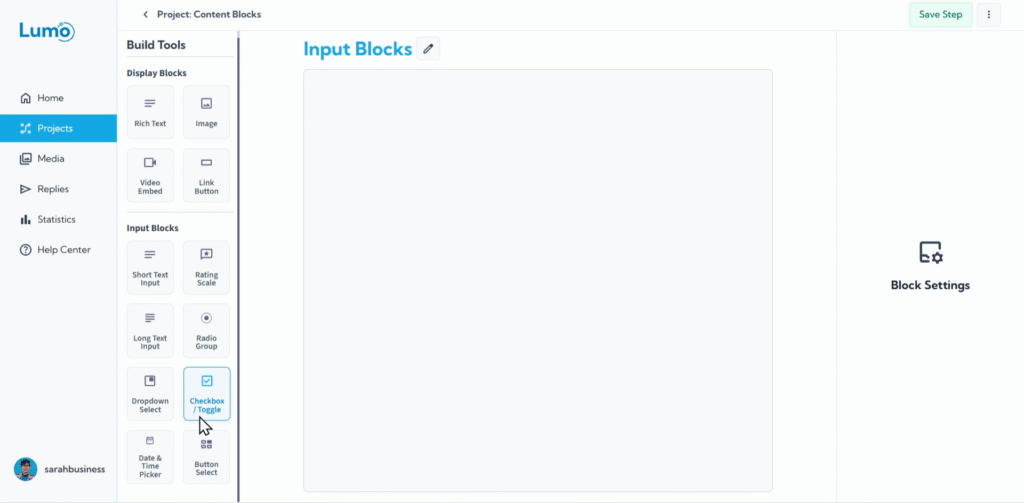
Checkboxes are a fundamental way to collect binary choices (yes/no, true/false) or to allow users to select multiple independent options from a list. The Checkbox block in LumoPages provides a straightforward and visual method for users to indicate agreement, opt-in, or choose from a set of non-exclusive options.
This guide will explain how to set up Checkbox fields in your Lumo.
What is a Checkbox Field?
A Checkbox field displays a small box that users can click to either "check" (select) or "uncheck" (deselect) an option. It's used for:
- Independent binary choices: For a single "yes" or "no" type of question (e.g., "I agree to the terms").
- Multiple selections: When you present several checkboxes, users can select any combination of them (e.g., "Select your favorite flavors: Chocolate, Vanilla, Strawberry").
- Toggle vs. Box Type: LumoPages offers visual variations, allowing you to display it as a traditional square box or a more modern "toggle" switch.
Step-by-Step: Adding a Checkbox Field
Configure the Checkbox: After adding the block, you'll set its properties:
Type: Choose how the checkbox is visually displayed:
- Box: A traditional square checkbox.
- Toggle: A switch-like UI element, often used for "On/Off" states.
Saving Your Changes
Always remember to manually save your changes after configuring Checkbox fields by clicking the "Save" button in the editor.
If you try to exit the editor without saving, LumoPages will remind you to save your work. This ensures your form design and settings are preserved.
Checkboxes are excellent for clear, straightforward choices and for allowing users to select multiple items from a presented list. They contribute to a clean and intuitive user interface.