Diseñar tu Lumo
Personalizar el diseño de tu Lumo
While templates provide an excellent starting point, LumoPages gives you granular control over almost every visual aspect of your Lumo. This means you can fine-tune colors, fonts, spacing, and more, ensuring your digital form perfectly matches your brand identity and aesthetic vision. This level of customization allows you to create a truly unique and professional user experience.
This comprehensive guide will walk you through the extensive visual customization options available in LumoPages.
Accessing Design Customization Options
- Enter Your Project Editor: Navigate to the Lumo project whose design you want to customize.
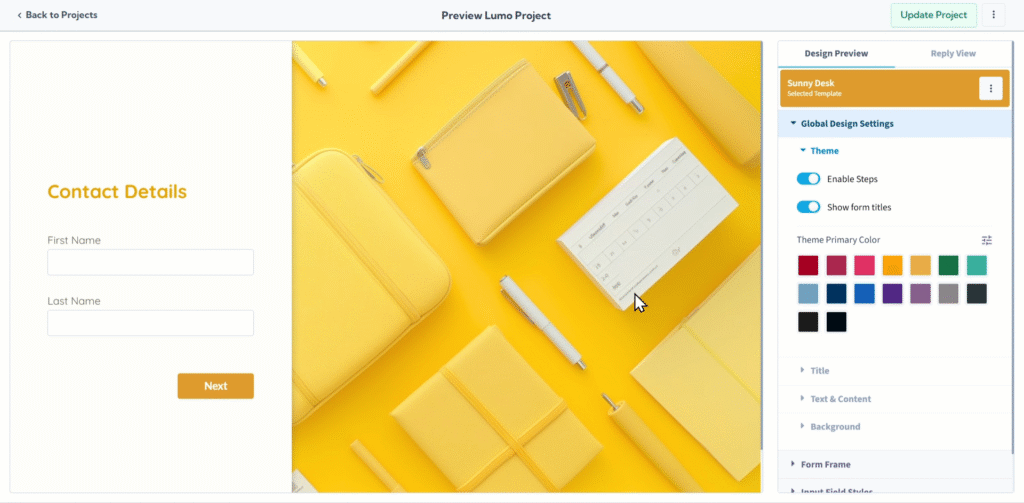
- Access "Design Preview" Settings: In the project editor, click on the "Preview & Design" tab or menu item. This panel is where you'll find all the visual customization tools.
A chosen template offers a solid foundation, but the power to personalize is always in your hands. You can then dive into the customization options to tailor every design element to your precise preferences.
The "Design" panel is your gateway to detailed customization. Here, you'll find thoughtfully organized categories, each offering precise control over different design elements.
Global Design Settings
These settings provide overarching controls that influence your Lumo's entire look and feel across all stages, setting the foundation for your design.
Theme
This is your starting point for overall design.
- General Theme Settings: Define the overarching aesthetic.
- Enable Steps: Toggle this to visually guide users through multi-stage Lumos with clear progress indicators (e.g., "Step 1 of 3").
- Show or Hide Form Titles: Decide whether to display the titles of your form's stages or the main form title for a cleaner or more detailed presentation.
- Primary Color Selection: This is where you set your brand's signature hue. LumoPages intelligently applies this chosen color as a default for key elements like buttons, main titles, and accents across your Lumo, ensuring instant brand consistency.
Title
Dedicate attention to your Lumo's main heading.
- Text Font, Color, Size, and Weight: Choose the perfect font family, select its color, and adjust its size and boldness to make your Lumo's title truly stand out and align with your typography.
- Text Alignment: Precisely position your title by setting its horizontal alignment (left, center, or right).
Text & Content
Control the readability and appearance of all your form's body text and general content.
- Text Font, Color, Size, and Weight: Select the font family, choose its color, and adjust its size and boldness for your instructional text, descriptions, and any content blocks, ensuring clear readability and brand cohesion.
- Text Alignment: Define the horizontal alignment for your body text (left, center, or right).
Background
Personalize the backdrop of your entire Lumo page.
- Background Type: Choose your background type from a dropdown: Color, Image, or Gradient.
- Color Selection: If you choose "Color," select from a palette of predefined colors or pick a custom color.
Form Frame Settings
These settings control the overall container that holds your form's content on the page, shaping its appearance and placement.
Container
This controls the fundamental structure and positioning of your form's main box on the page.
- Form Frame Position: Precisely align your entire form frame on the page (e.g., Left, Center, Right).
- Frame Width & Height: Adjust the dimensions of your form's container using "Default," "Limited," or "Full" options to make it compact, expansive, or fit to its content.
- Padding of Frame: Fine-tune the internal space between the frame's border and its content, ensuring comfortable readability and visual balance.
- Margin of Frame: Control the external space around the frame on the page, defining its placement relative to other elements and overall page layout.
Background
Personalize the background within your form's specific container.
- Background Type: Choose your background type from a dropdown: Color, Image, or Gradient.
- Color Selection: If you choose "Color," select from a palette or pick a custom color (similar to the global background color selection, but applied specifically to the form frame).
Border
Add a stylish edge and visual definition to your form frame.
- Border Size, Color, and Style: Define the thickness, hue, and pattern (Default, Thin, Thick, Dashed) of the outer border.
- Corner Radius: Adjust the roundness of your form frame's corners, from sharp squares to beautifully rounded edges.
- Shadow Spread and Color: Apply subtle or pronounced shadows, controlling their spread and color, to give your form a sense of depth and make it pop off the page.
Input Field Styles
The "Input Field Styles" section gives you the power to design every single input field your users interact with, ensuring a consistent, intuitive, and visually appealing experience across your entire Lumo.
Field Input
Control specific aspects of the input area itself.
- Mark Required Fields: Toggle this option to visually indicate which fields are mandatory for submission (e.g., with a red asterisk
*), guiding users to complete essential information.
Container
Control the appearance and placement of the area surrounding each input field.
- Alignment of Field: Define the horizontal alignment of the input field within its container.
- Width of Field: Set the width of the field to fit your design perfectly, whether default, limited, or full width.
Border
Apply custom borders to your input fields for added visual polish.
- Border Size, Color, and Style: Adjust the thickness, color, and pattern (Default, Thin, Thick, Dashed) of the input field's border.
- Corner Radius: Round the corners of your input fields for a softer, more modern look.
- Shadow Spread and Color: Add subtle or pronounced shadows to give fields a subtle lift.
Button Styles
The "Button Styles" section is where you design your calls-to-action, making them irresistible and perfectly on-brand.
Container
Control the overall placement and size of your buttons.
- Alignment of Buttons: Set the horizontal alignment of your buttons (e.g., Left, Center, Right) for optimal placement.
- Width of Buttons: Define the width of your buttons (e.g., Default, Limited, Full) to control their visual presence.
Font
Customize the text that appears on your buttons for maximum impact.
- Text Font, Color, Size, and Weight: Choose the font family, select its color, and adjust its size and boldness for clear readability and brand alignment.
- Text Alignment: Adjust the text's alignment within the button itself (e.g., left, center, right).
Border
Add a stylish edge to your buttons.
- Border Size, Color, and Style: Define the thickness, hue, and pattern (Default, Thin, Thick, Dashed) of the button's border.
- Corner Radius: Adjust the roundness of the corners for rounded or sharp buttons.
- Shadow Spread and Color: Apply subtle or pronounced shadows to make your buttons pop and add depth.
Basic Button Color
While your primary theme color often sets button defaults, you can specifically define the color for non-primary buttons (e.g., a "Back" button might have a different, less prominent color than a "Submit" button).
- Color Selection: Choose the specific color for these buttons from a palette.
Iterative Design and Previewing
Customizing your Lumo's design is often an iterative process. Make a change, then use the Preview feature to see how it looks in real-time. This allows you to fine-tune until everything is perfect.
Saving Your Lumo's Design Changes
All your design customizations are part of your project's overall settings. It is crucial to manually save your changes after configuring your design. Always click the prominent "Save" button in the editor.
If you try to navigate away from the editor after making design changes without saving, LumoPages will remind you to save your work. This is vital to ensure your Lumo's updated appearance is live, especially if it's currently published and accessible to users.
With LumoPages' comprehensive design customization options, you have the power to create a Lumo that not only functions flawlessly but also perfectly reflects your brand's unique identity. Invest time in these details, and your digital forms will truly stand out.